
Clarence Arcade
Logo Creation | Brand Design | Visual Direction
A New Identity for an Ashton Landmark
Built in 1894, Clarence Arcade is an important part of Ashton-under-Lyne's architectural and commercial heritage.
Now entering a new chapter, the historic arcade is being regenerated as a destination for independent retailers, makers, artisans and visitors.
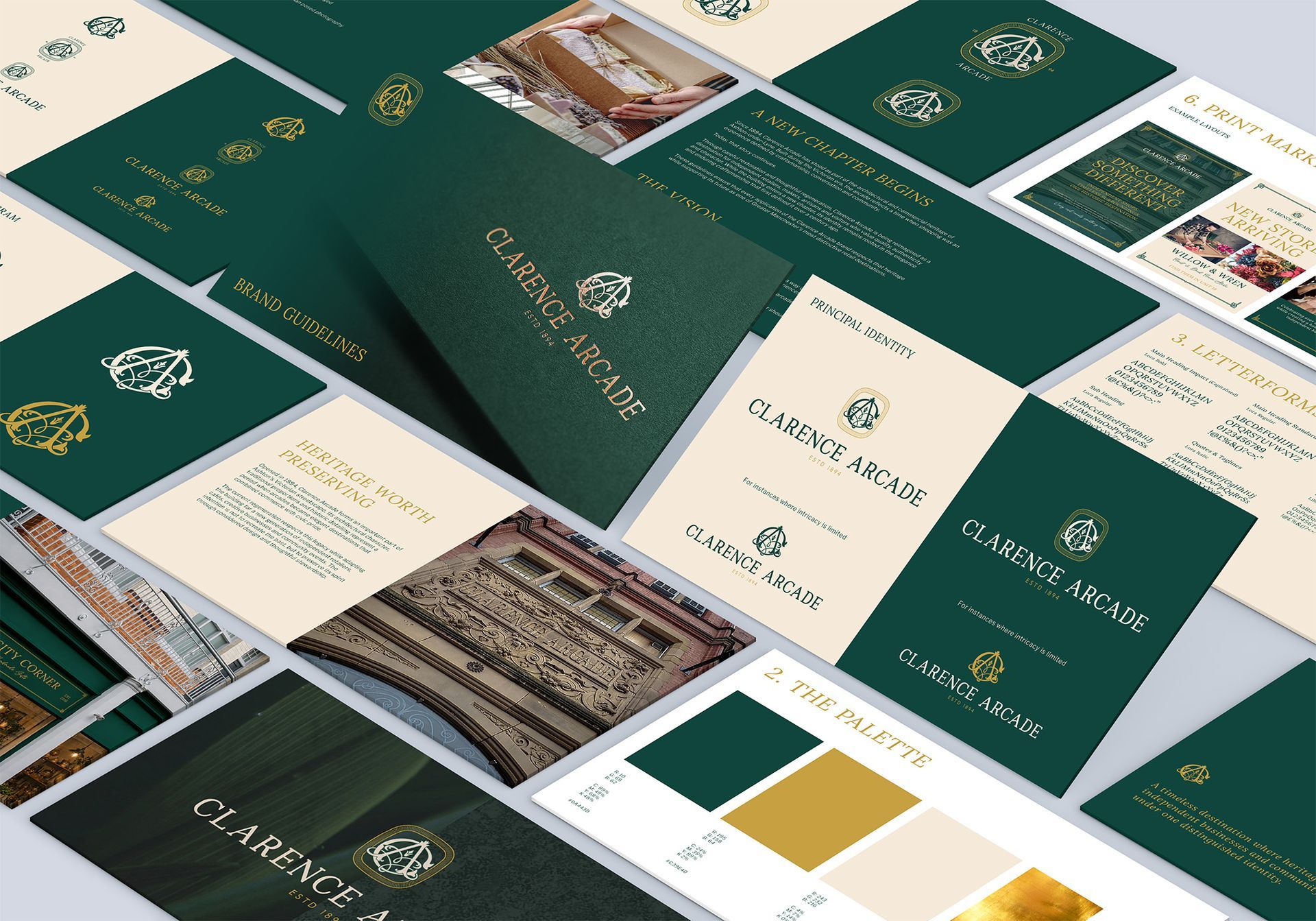
Pickle was commissioned to create a visual identity and brand guidelines that could bridge those two worlds, protecting the character and heritage of the building while establishing a premium, contemporary identity for its future.
The result is an identity rooted in craftsmanship, elegance and longevity.
The Challenge
How do you give a historic building a new identity without losing what makes it special?
Clarence Arcade already had something that can't be manufactured:
history.
The architecture provides an extraordinary foundation, from its ornate stonework and Victorian detailing to its distinctive ironwork and proportions. The challenge was therefore not to make the brand look old. It was to create something that felt established, distinguished and timeless.
The identity needed to work across the building itself, individual shopfronts, printed materials, digital communications, events and signage, while giving future traders enough flexibility to express their own personalities.
That's where the idea of a shared visual language became central to the project.
A Mark With Character
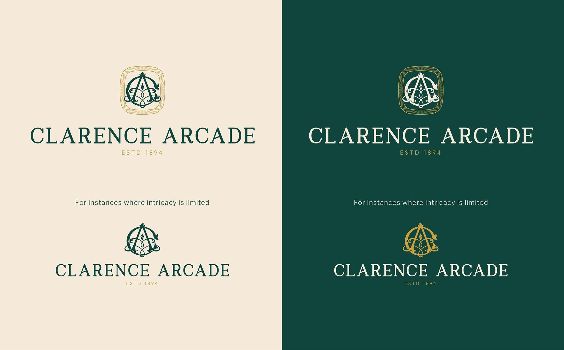
At the heart of the Clarence Arcade identity is a bespoke monogram created specifically for the building.
The intertwined C, A and architectural flourishes create a distinctive mark that draws on the ornamental language of the Victorian era without simply reproducing historical decoration. Its purpose is to feel as though it could have always belonged to Clarence Arcade. Something that might have appeared on a brass plaque in 1894, yet still feels relevant today.
Bespoke. Distinctive. Enduring.
Quietly Confident
The visual language takes its cues from the building's architecture and the idea of a traditional British retail destination.
Deep green provides the foundation.
Antique gold introduces warmth and prestige.
Cream creates space and allows the identity to breathe.
Lora provides the distinctive editorial character, while Libre Franklin brings clarity and practicality across supporting communications. Your guidelines establish this combination explicitly.
A New Chapter Begins
Clarence Arcade was built to be a destination.
More than 130 years later, its next chapter is being shaped around the same principles that made it special in the first place, craftsmanship, individuality, community and the simple pleasure of discovering something new.
The new identity gives that vision a distinctive voice, creating a brand that can live across the architecture, the businesses within it and the experiences yet to come.
Strong businesses deserve branding and marketing that match their ambition.
Let’s create something that moves your business forward.